
JEWELL PAINTS · LAYERS OF LUXURY
COLOR EDIT / 2026/27
The art of
living in colour.
Thoughtfully composed palettes for the rooms, rituals and moments that make a home your own.
Explore by room ↘Eight rooms. Ten ways to make them yours.
BUILT AROUND THE FEELING YOU WANT TO COME HOME TO.COLOUR, IN ITS PLACE
Every room has
its own rhythm.
Begin with the room. Explore considered combinations, then make each one your own.
A collection of considered combinations
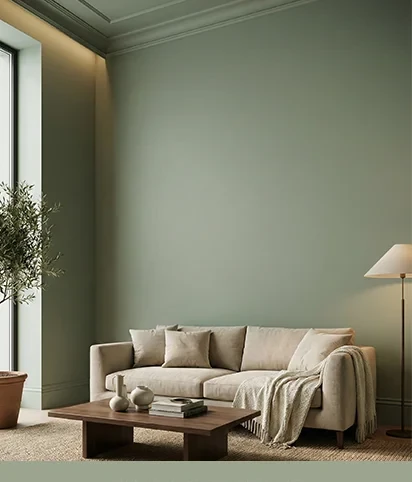 A HOME IS MADE IN THE LAYERS.
02 / AN EYE FOR BALANCE
A little contrast.
A lot of harmony.
Begin with a foundation that feels natural. Bring in depth through a considered second shade, then let one expressive colour do just enough.
Set the foundationLet light, architecture and natural materials lead.
Add another layerUse a companion shade to create calm and continuity.
Make it personalPlace an accent where you want the eye to linger.
A NOTE ON COLOUR
Every combination here is an editorial starting point. Screen colours are indicative; see a physical Jewell shade card in your own light before making your final choice.
YOUR HOME, IN YOUR OWN COLOURS